What you need to know
- Google Maps is streamlining trip details, making the interface cleaner and more focused on key information.
- The ETA now pops up bigger and bolder in a split, left-aligned display, making it the star of the show.
- The redesign is live across all transport modes in version 25.13.06, but it’s server-side, so your experience might differ.
Google Maps is tightening up the way trip details show up on screen, making everything cleaner and packed with just the right information.
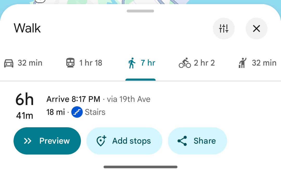
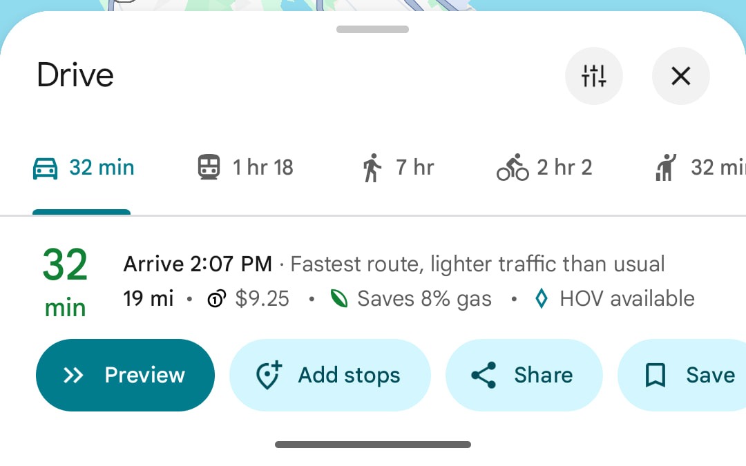
9to5Google has spotted a new design in the directions overview, where the color-coded ETA now pops up bigger on a split, left-aligned display. This makes that key information stand out more.
Before the update, Google Maps crammed all your trip details—including time and distance—into three tight lines at the bottom of the screen. Both the hours and miles got the same plain text treatment, while half the space sat empty like unused trail.
ETA gets the spotlight
The redesign gives the interface a modern feel with a cleaner information layout. While the distance is still there, it takes a backseat, making room for extra details like the ETA. Now, users can easily see things like fuel efficiency and, most importantly, their expected arrival time.
Previously, on Android, Google Maps gives a quick look at distance and travel time affected by traffic in the overview. To see more information, like parking or toll costs, you have to either expand the overview or tap the menu. But that’s changing with this update.
The visual redesign rolls out across all transport modes in Google Maps, starting with version 25.13.06. While 9to5Google reports a broad rollout, it’s still activated server-side, so the experience may vary for different users.
Sure, the new layout takes some getting used to. But comparing the old and new designs shows a clear appreciation for Google’s improved look. At the end of the day though, we’re all just along for the ride – it’s not like Google is giving us a vote in the redesign.


